Gaming
From Valsad to SC: Justice Pardiwala holds fate of $3 billion gaming industry, 2 lakh jobs

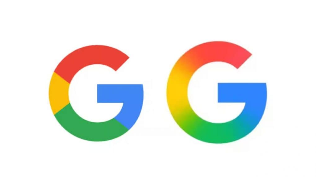
Google has unveiled a refreshed version of its iconic 'G' logo, marking the first significant update in nearly a decade. The new design transitions from the traditional four solid color segments to a seamless gradient that blends red, yellow, green, and blue hues.
This change aligns the logo's aesthetic with the gradient style used in Google's Gemini branding and the AI Mode in Search.
The updated logo has begun appearing on the Google app for iOS and Pixel devices, following the rollout of version 16.18 (beta) on Android. However, the classic segmented 'G' remains visible on other Android devices and web platforms, indicating a phased implementation .
This subtle redesign is said to reflects Google's ongoing efforts to modernize its visual identity, ensuring consistency across its product ecosystem. While the primary six-letter 'Google' logo remains unchanged, the introduction of the gradient 'G' suggests potential future updates to other Google product icons, such as Chrome and Maps, to maintain a cohesive brand appearance.
As of now, Google has not provided an official statement regarding the broader rollout of the new logo across all platforms.
It is to be noted that the company last made a major change to its logo in September 2015, when the company updated its font to a sans-serif typeface.
Big-ticket buying decisions now demand more than just logic and product specs – they require trust, emotional connection, and brand stories that resonate.
Read MoreThe Online Gaming Bill 2025 imposes severe penalties, allows warrantless search and seizure, and empowers a central authority to regulate the digital gaming ecosystem. It is expected to disrupt platforms, payment systems, and advertising in the sector. Here's all you need to know about the bill.