Gaming
From Valsad to SC: Justice Pardiwala holds fate of $3 billion gaming industry, 2 lakh jobs
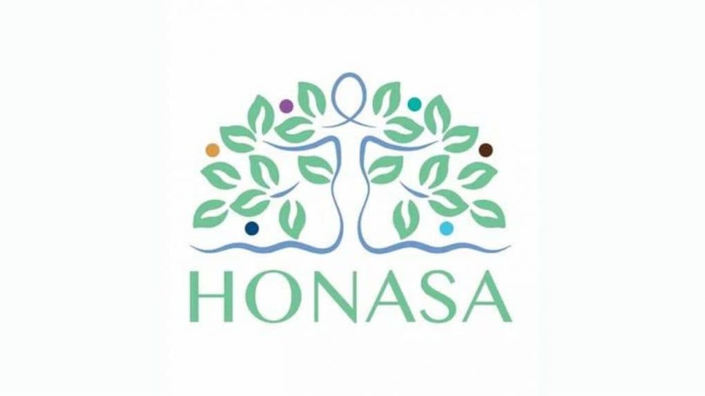
Honasa Consumer, the parent company of popular brands Mamaearth, The Derma Co., and Aqualogica, has come up with a fresh corporate identity.
The new corporate identity is made up of three fundamental elements: an elegant female figure, the iconic tree of life, and a spectrum of vibrant circles.
The feminine silhouette is a reflection of the nurturing spirit of a mother, paying homage to the brand Mamaearth. The tree of life implies the ideals of progress, balance, and prosperity. The kaleidoscope of multicoloured circles speaks for the fruitful outcomes of dedicated toil and the diverse array within the brand portfolio.
The logo signifies agility, lucidity, and innovation. This unveiling is a representation of the company’s strive for evolution, innovation, and consumer centricity.
Big-ticket buying decisions now demand more than just logic and product specs – they require trust, emotional connection, and brand stories that resonate.
Read MoreThe Online Gaming Bill 2025 imposes severe penalties, allows warrantless search and seizure, and empowers a central authority to regulate the digital gaming ecosystem. It is expected to disrupt platforms, payment systems, and advertising in the sector. Here's all you need to know about the bill.