Advertising
From Pink Slips to Silent Sidelining: Inside adland’s layoff and anxiety crisis
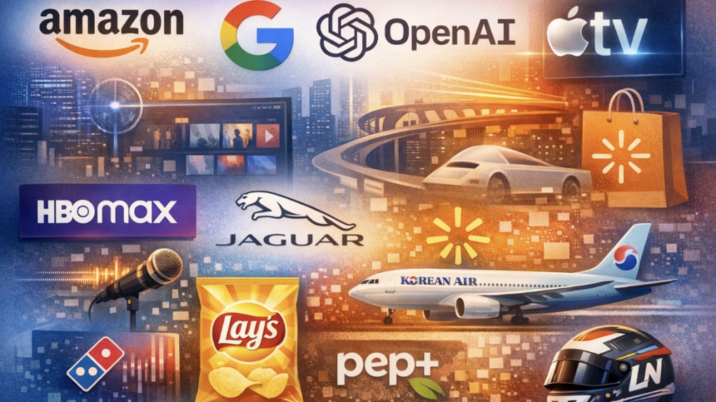
Across industries in 2025, companies increasingly revisited their visual and strategic identities amid changes in technology, consumer behaviour and platform dynamics.
Rather than incremental logo updates, many organisations undertook broader brand repositioning exercises linked to artificial intelligence, digital-first consumption, portfolio expansion and evolving expectations around trust and relevance. These changes spanned technology, FMCG, aviation, media, retail and even personal brands.
Below is an overview of how some of the most prominent rebrands of 2025 unfolded and what they indicate about the current branding landscape.
Technology Brands Prioritise Approachability and System Design
Amazon introduced its first major brand refresh in over two decades, updating its core visual identity to create consistency across its expanding ecosystem of products and services. The redesign included a deeper curve in the smile logo, a more saturated orange, and the rollout of Ember Modern, a custom typeface developed to standardise design across more than 50 sub-brands. The update reflected a focus on cohesion and accessibility as the company scales AI-driven and automated services.
Google also refined its visual identity, updating its “G” logo with smoother gradients and rounded edges. The adjustments were designed to function effectively across AI interfaces, wearables and animated digital environments, reflecting the brand’s transition toward screen-native and responsive design systems.
OpenAI implemented a comprehensive identity overhaul as it expanded from a research-focused organisation into a global platform provider. The new branding introduced a simplified logo, a custom geometric wordmark and a restrained colour palette intended to support clarity and differentiation across enterprise and consumer-facing products.
Apple TV removed the “+” from its name in 2025, simplifying its branding while introducing a fluid, glass-inspired animated logo. The change aligned with Apple’s broader emphasis on minimalism and platform integration.
Legacy Brands Reassess Equity and Recognition
Warner Bros. Discovery reinstated the HBO Max name in July 2025 after operating the streaming service under the shorter “Max” brand. The decision followed consumer feedback and internal assessments indicating that the HBO name continued to carry strong associations with premium content and quality.
Jaguar unveiled a new minimalist identity, replacing its traditional leaping cat emblem with a wordmark and a simplified “J” symbol. The redesign was positioned as part of the brand’s transition toward an electric-only future and a more contemporary luxury positioning.
Walmart updated its visual identity with a refreshed spark icon, a custom typeface inspired by founder Sam Walton’s handwriting, and a digital-first colour palette. The changes were framed as an evolution rather than a departure from the brand’s heritage.
FMCG Brands Emphasise Familiarity and Sensory Recognition
Lay’s rolled out its most extensive packaging redesign in over a century, introducing warmer colours, sun-inspired visual elements known as “Lay’s Rays,” and increased emphasis on ingredients. The refresh aligned with broader FMCG trends focused on transparency and comfort-driven branding.
Domino’s expanded its branding beyond visuals by introducing a “cravemark” and a branded audio identity, including a jingle developed in collaboration with musician Shaboozey. Select campaigns used an elongated spelling of the brand name to highlight sensory appeal and brand recall.
Starbucks continued refining its siren logo for improved legibility across mobile apps and delivery platforms, while Mountain Dew announced plans to introduce a nostalgic, 1990s-inspired flat logo design, reflecting a renewed focus on heritage and outdoor culture.
Corporate Identity Updates Reflect Organisational Complexity
Zomato renamed its parent company Eternal in early 2025 as its business expanded beyond food delivery into quick commerce, B2B supply and dining services. The Zomato brand continues to operate as the consumer-facing app, while Eternal functions as the holding company.
PepsiCo introduced its first major corporate identity update in nearly 25 years. The redesign featured a lowercase wordmark, an earth-toned colour palette and simplified iconography. The update was closely linked to pep+ (PepsiCo Positive), the company’s long-term sustainability and transformation strategy focused on environmental impact, nutrition and operational efficiency.
Korean Air refreshed its branding in conjunction with its merger with Asiana Airlines. The updated identity modernised the Taeguk symbol and introduced a more premium aircraft livery to signal integration and continuity.
Lifestyle, Beauty and Personal Brands Adjust Positioning
La-Z-Boy reintroduced its brand identity with a softer script logo and revised messaging centred on comfort, wellness and home-focused lifestyles. The update aimed to broaden the brand’s appeal to younger demographics and contemporary living preferences.
Benefit Cosmetics shifted its logo colour from pink to black and removed geographic references to support a more global and mature brand positioning.
Formula 1 driver Lando Norris streamlined his personal branding into a simplified “LN” system, creating consistency across merchandise, digital platforms and commercial partnerships.
Consumer Response Highlights Limits of Change
Not all rebrands were sustained. Cracker Barrel briefly introduced a modernised logo in 2025 but reverted to its previous identity following negative customer feedback, highlighting the challenges legacy brands face when altering recognisable symbols.
Observations From 2025’s Rebranding Activity
Brand updates in 2025 largely reflected organisational changes rather than aesthetic trends. Many companies focused on system-wide consistency, digital adaptability and alignment with long-term strategic priorities.
The year underscored the growing role of branding as an operational tool, supporting scale, integration and clarity, rather than solely a visual exercise.
From purpose-driven work and narrative-rich brand films to AI-enabled ideas and creator-led collaborations, the awards reflect the full spectrum of modern creativity.
Read MoreLooking ahead to the close of 2025 and into 2026, Sorrell sees technology platforms as the clear winners. He described them as “nation states in their own right”, with market capitalisations that exceed the GDPs of many countries.