How it Works
WPP, Havas, Omnicom: Are advertising’s biggest holdcos recasting agencies as AI Operating Systems?
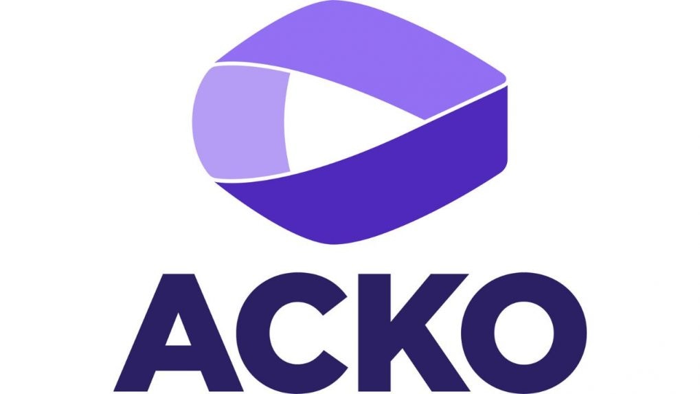
ACKO, the D2C protection platform, has taken a step towards revamping its brand identity.
The new logo is inspired by the Möbius strip, a one-sided surface that symbolizes infinite trust, inclusivity, and collaboration. Retaining the signature purple colour, the sharpness and boldness in the new logo demonstrates ACKO’s dynamism and innovation, mentioned the company in a statement.
The refreshed identity signifies the company’s maturity and seriousness, reinforcing its commitment to growth, innovation, and customer-first solutions, stated the company in a statement.
“Our refreshed identity reflects who we are today and where we aspire to be tomorrow. It’s bold, fresh, and fearless—just like the disruption we’ve brought to the insurance industry since day one,” said Prateek Malpani, Head of Brand, ACKO. “The Möbius strip in our logo symbolizes our unwavering commitment to infinite trust and partnership with our customers. At ACKO, it’s never us versus you; it’s always us with you. This brand identity revamp represents our journey forward as we strive to bring peace of mind to millions of customers in India through protection, preservation, and prosperity.”
From purpose-driven work and narrative-rich brand films to AI-enabled ideas and creator-led collaborations, the awards reflect the full spectrum of modern creativity.
Read MoreThe Storyboard18 Awards for Creativity have unveiled a Grand Jury comprising some of India’s most influential leaders across advertising, business, policy and culture, positioning it among the country’s most prestigious creative award platforms.