Advertising
From Pink Slips to Silent Sidelining: Inside adland’s layoff and anxiety crisis
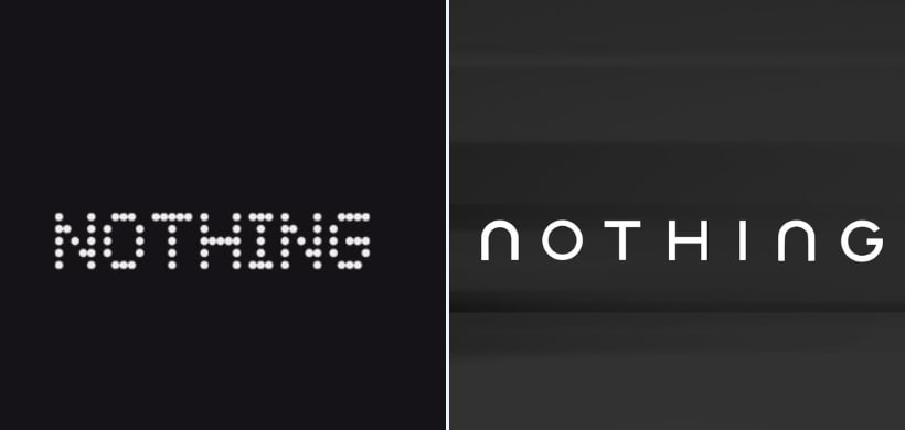
Consumer electronics brand Nothing has confirmed a significant overhaul of its brand identity, unveiling a new logo that marks a clear departure from the pixel-style visual language it has used since its inception.
The company announced the redesign in a post on X, sharing two monochrome teaser images that reveal a new wordmark. The post was accompanied by the tagline “Getting ready to make history,” but did not include any further details on the rationale behind the change or whether it forms part of a broader rebranding exercise.
GETTING READY TO MAKE HISTORY pic.twitter.com/cnvnQitego
— Nothing (@nothing) January 19, 2026
The teaser images suggest a cleaner, more conventional typographic style, moving away from the dot-matrix and pixel-inspired design that has been closely associated with the Nothing brand. The company has not referenced any upcoming products, launch events or timelines, indicating that the announcement is focused solely on brand identity rather than hardware.
Shift from Nothing’s original design language
Since launching, Nothing has positioned itself as a design-led consumer technology brand, using distinctive visual elements to stand out in the crowded smartphone and audio markets. The apparent redesign signals a move toward a more restrained and mainstream aesthetic, potentially reflecting the company’s evolution as it expands its product portfolio.
If rolled out fully, the new logo could serve as a unifying identity across Nothing’s growing range of devices, including smartphones, audio products and its sub-brand CMF.
Online reactions divided
The teaser has drawn mixed reactions online. While some users described the redesign as a natural progression for a maturing brand, others expressed concern that abandoning the pixel-style logo could weaken Nothing’s visual distinctiveness.
A number of users also pointed out similarities between the teased wordmark and the recently updated Jaguar logo, sparking debate about originality and design direction.
What comes next
Nothing has yet to confirm when the new logo will be officially adopted or whether it will be rolled out across its website, packaging, applications and marketing assets. A more detailed announcement or coordinated brand refresh is expected in the coming days.
For now, the teaser marks one of the most notable shifts in Nothing’s branding strategy since the company was founded.
From purpose-driven work and narrative-rich brand films to AI-enabled ideas and creator-led collaborations, the awards reflect the full spectrum of modern creativity.
Read MoreLooking ahead to the close of 2025 and into 2026, Sorrell sees technology platforms as the clear winners. He described them as “nation states in their own right”, with market capitalisations that exceed the GDPs of many countries.