Advertising
From Pink Slips to Silent Sidelining: Inside adland’s layoff and anxiety crisis

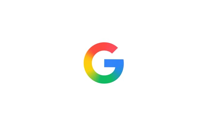
In the pantheon of iconic corporate logos — the swoosh, the apple, the swooping arcs — few are as instantly recognizable as Google’s multicolored “G.” But even that visual emblem, long a symbol of digital ubiquity, is getting a refresh. On Monday, Google announced that the gradient version of the “G,” first tested in its Search environment earlier this year, will become the standard “G” across the entire company.
The change is subtle: the familiar red, yellow, green and blue hues remain, but their edges now blend into one another in a smooth gradient rather than occupy sharply divided quarters. The redesign, Google says, is intended to reflect its evolution “in the AI era” — a visual signal that Google is transforming not just how it looks, but how it positions itself in the age of generative models and intelligent assistants.
A Decade in the Making
It has been ten years since Google last refreshed its “G.” In 2015, the company moved from a lowercase “g” in a blue square to a bold, circular “G” composed of four discrete color wedges — a design choice meant to unify Google’s presence across apps, devices and web services.
That move coincided with the rollout of the “Product Sans” wordmark and a more modern visual identity.
But in the intervening decade, Google’s internal ambitions and external positioning have shifted. The rise of artificial intelligence has become a central pillar of its strategy, from deep technical investments like custom tensor processing units to product integrations like Gemini, AI Overviews in Search, and an “AI mode” in Chrome.
The new gradient “G” is meant to tie the visual identity to those deeper changes — a relatively lightweight but symbolic update during a period of heavier technological transformation.
From Search to Companywide Branding
Earlier this year, Google first deployed the brighter gradient “G” within Search as a test bed.
Now, the company plans to extend that across its full footprint — in mobile apps, system icons, web favicons, enterprise surfaces, kiosks and partner branding — over the coming months.
The rollout is expected to be gradual, with coexistence of old and new visuals during the transition.
Some traces of this shift are already visible. Designers have noted that the new gradient “G” began showing up in Google apps on iOS and Pixel devices earlier in the year.
Because the change is subtle—and the “G” appears at small sizes—the updated icon may not be obvious to everyone.
Critically, the update applies only to the “G” icon — Google’s full logotype (the six-letter “Google”) remains unchanged — and Google has not announced wholesale redesigns of its sub-brands like Maps or Gmail.
The company is instead anchoring the change around a central symbol that can cascade outward over time.
More Than a Cosmetic Shift
At first glance, the change might seem cosmetic: a few pixels smoothed, colors blended. But in Silicon Valley, visual identity is often used as a narrative device — a way to show that the internal strategy is evolving even when the outward structure remains intact.
Consider Google’s broader investments in AI. In December 2024, Google DeepMind and related teams launched Gemini 2.0, a more capable, multimodal model that supports image, audio, reasoning, and tool usage. Google says its TPU infrastructure, including its custom “Trillium” chips, powered 100 percent of the training and inference.
The company has also folded Gemini’s capabilities more deeply into products: in Search, for example, the “AI Overviews” feature claims to reach over a billion users.
In Chrome, Google is embedding AI directly within the browsing experience — introducing an AI “assistant” within the browser that can span tabs and use context to help answer questions or navigate content.
For Google, the new “G” is a symbolic anchor tying together these technical shifts with a coherent visual language. Through the gradient, the company is signaling that the era of discrete app silos is giving way to an integrated, AI-first identity.
Brand Risk and Design Trade-Offs
Any time a company with Google’s scale touches a logo, the risks come into sharp relief. In reimagining a symbol as familiar as the “G,” designers must balance modernization with recognition. Change too much, and users may feel disoriented; change too little, and the update may feel superficial or hollow.
Google has likely tested the icon at dozens of sizes and scenarios to ensure legibility in notifications, launchers, web browser tabs, among others.
A Visual Anchor for the AI Era
In the decades since its founding, Google has been no stranger to reinvention. What began as a search engine has become a sprawling ecosystem spanning cloud infrastructure, generative AI, hardware, and developer tools. The company reorganized under Alphabet in 2015, but the Google brand has remained its core public face.
Now, as AI becomes central to its identity, the new gradient “G” serves as a visual hinge: familiar enough to preserve continuity, but modern enough to suggest that Google is stepping through a door into its next chapter.
From purpose-driven work and narrative-rich brand films to AI-enabled ideas and creator-led collaborations, the awards reflect the full spectrum of modern creativity.
Read MoreLooking ahead to the close of 2025 and into 2026, Sorrell sees technology platforms as the clear winners. He described them as “nation states in their own right”, with market capitalisations that exceed the GDPs of many countries.