PepsiCo's first new corporate identity in 25 years sparks debate
After 25 years, PepsiCo’s bold new logo ditches the iconic red-and-blue palette for earthy tones and a lowercase identity. But branding experts say the rebrand feels more like an escape from its cola roots than an evolution.


ADVERTISEMENT
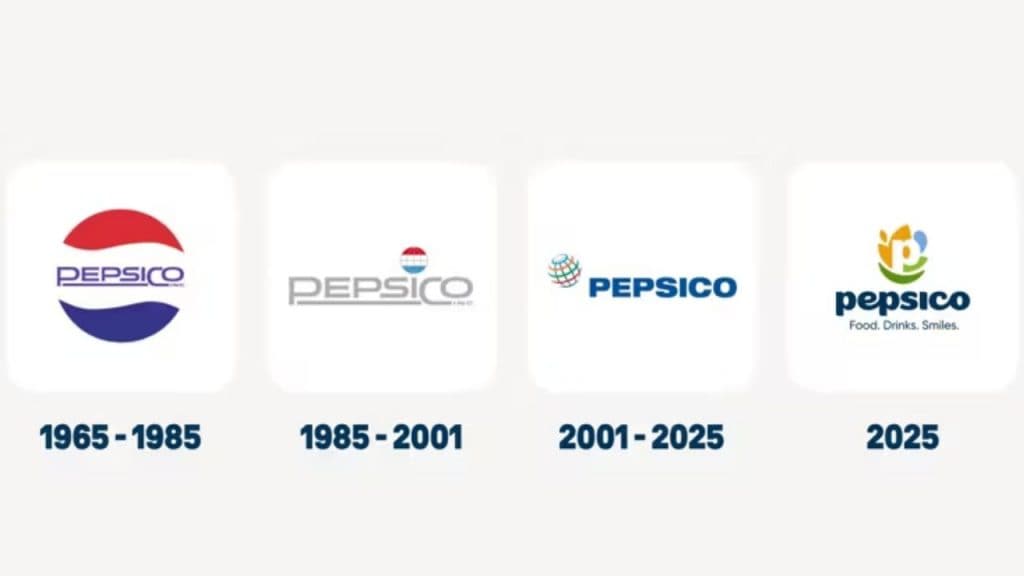
PepsiCo has unveiled a new corporate identity after a quarter of a century: a move that has set off a wave of mixed reactions across the branding and design world. The rebrand, featuring soft, earthy tones in place of the classic red-and-blue palette, lowercase typography, and a tagline that reads “Food. Drink. Smiles.”, is meant to reflect PepsiCo’s broader focus beyond colas. But many experts believe the transformation says less about evolution and more about retreat.
PepsiCo’s first rebrand in 25 years marks a shift to a ‘Branded House’ strategy
“It is ironic, and a bit amusing, that PepsiCo wants to distance itself from brand Pepsi,” remarked Tarun Rai, Co-Chairman, Start Design Group. “Over the decades PepsiCo seems to have been trying to move its corporate logo away from that of its lead brand, Pepsi Cola. They did so diffidently, never really letting go completely. But now they have, finally, decided after twenty-five years, to make a ‘radical’ move to reflect their current portfolio and priorities.”
As far as the logo is concerned, according to him, while it’s not very original or distinctive, it achieves its purpose of moving away from the Pepsi cola colors and identity. The base line also is rather prosaic. It seems just a notification of the company’s business – Food and Drink. And Smiles is, according to the press release, a hat-tip to their mission statement.
According to Rai, the shift marks a symbolic separation from Pepsi’s fizzy past, but one that might have gone only halfway.
"You can change the visual identity to try and distance yourself from the cola legacy but people – investors, retail partners, employees- will refer to the company as PepsiCo. The cola legacy continues in the company’s name. And that’s the reason I said it is ironic and amusing," he says.
Unlike, consumer-facing product brands, a corporate brand does not run as much of a risk in a logo change. Pepsi’s own competitor faced the ire of consumers when they decided to launch New Coke. They had to hastily revert to the original. More recently Jaguar had to manage a huge outcry when they announced their new concept car and logo. Even the US President got involved in Cracker Barrel’s logo change and asked the company to revert to its original logo!
"While there is not much of a risk of something like this happening for a change of a corporate logo there is certainly a cost. From internal stationary to the fine print on all product packaging. It, therefore, begs the question, if you are doing this change after twenty-five years, why not go the whole hog?" he quips.
“It’s an opportunity missed,” he concluded.
We strive to be globally knowledgeable while being locally relevant: Gianmauro Vella of PepsiCo
Rai points to examples of companies that have evolved successfully by rebranding entirely- from International Business Machines becoming IBM to Facebook becoming Meta, and ITC moving beyond its tobacco origins.
Even Nestle tries to capture a bit more by saying ‘Good Food. Good Life’. And Smiles is not really ‘ownable’. Colgate owns it and has, in fact, incorporated it visually in their own new corporate identity re-launch with a baseline of ‘Make more Smiles’.
“Maybe PepsiCo could have tried a complete departure - PPC or something new,” he said.
‘Trying too hard to be sweet’
For Meenakshi Menon, Founder of GenSxty Tribe, the rebrand feels tonally off. “Pepsi can’t expect loyal consumers to welcome this new look with open arms. It is so not the brand,” she said.
“Pepsi has always been the edgier brand - the one with more charm and character. The new look is totally devoid of that,” Menon argued. “It’s trying too hard to be sweet- pun intended.”
Victory on the pitch, defeat in the market: How advertisers and brands fail India’s women athletes
She believes the refresh reflects PepsiCo’s attempt to align with changing social values around health and wellness. “PepsiCo is a company that makes most of its money selling sugared water, but it seems changing times are forcing it to signal responsibility and sustainability,” she said.
Yet, the result, she adds, is a logo that “feels like the physics nerd in a school known for its cricket prowess - there, but not there.”
‘A safe, corporate move’
Alagu Balaraman, Partner and Managing Director at CGN & Associates India, views the rebranding as a strategic but subdued move. “From the corporate point of view, the new brand has become generic, bland, and uncontroversial,” he said.
“It doesn’t look like the original Pepsi brand in any way, and that’s probably the point. It gives PepsiCo’s product brands - Pepsi, Lay’s, Quaker - room to chart their own visual identities.”
He believes the sanitised design helps the parent company avoid being visually tied to any product that may be criticised in the future. “For a global corporation operating in sensitive categories like beverages and snacks, being disconnected from a single product image is a safe choice.”
‘A logo that says too little, too loudly’
Mohit Hira, Co-founder of Myriad Communications, feels the design overcomplicates a simple idea. “There’s more being said about the new PepsiCo logo than it deserves,” he said. “Remember, it’s the company brand, not the familiar bottle of brown fizz.”
“In an increasingly cluttered world, brand identities today are about simplicity - this one certainly isn’t,” Hira noted. “It packs in everything a designer would detest. The letter P is far too overt, and the supposed smile is too subtle for customers to catch.”
India will be the engine of growth, says CEO Jagrut Kotecha as PepsiCo bets big on India
He quipped that a QR code leading to an explainer might have helped. “The design team that sold this idea deserves a medal,” he added wryly.
‘Inclusive and bottom-up’
Offering a more optimistic take, Harish Bijoor, Brand Guru and Founder of Harish Bijoor Consults Inc, said the rebrand was overdue. “PepsiCo is new at last after 25 years,” he said.
“This is the era of Gen Z and Gen Alpha, and they expect a different imagery from the companies they buy from. The rebranding is more inclusive and less top-down. It’s all about the smile - and that’s good, because food and drink are meant to leave a smile behind.”
‘A rebrand without legacy’
However, Krupa Sheth Kapadia, Creative Director at Stratedgy, finds the visual transformation too sterile for a company of PepsiCo’s stature.
“In theory, the new identity checks all the right boxes - inclusivity, sustainability cues, friendliness. But the outcome feels painfully safe,” she said.
“For a company of PepsiCo’s scale, ‘modern and simple’ shouldn’t mean ‘default and generic.’ The palette could have been more distinctive,” she added. “What’s missing most is legacy. Great rebrands reinterpret history; this one feels like a clean slate, as if PepsiCo were a promising start-up rather than a global institution.”
Kapadia argues that the design, in its quest to look approachable, sacrifices the gravitas of a heritage brand. “PepsiCo didn’t need to look younger; it needed to look more sure of itself - like a leader that’s evolved. The result isn’t offensive, just forgettable. And for a company whose brands shape global culture, that’s a problem.”
A radical refresh- or a retreat?
PepsiCo’s new look, though carefully crafted to align with contemporary values and global ambitions, has exposed the classic tension in corporate branding - between evolution and erasure.
End of the Old Guard? Publicis outperforms, WPP declines, Havas rises, Omnicom readies IPG merger
After 25 years, the company has indeed turned a page. But as multiple brand voices suggest, whether PepsiCo’s new identity writes a new chapter or simply blurs the old one remains to be seen.


")
")

