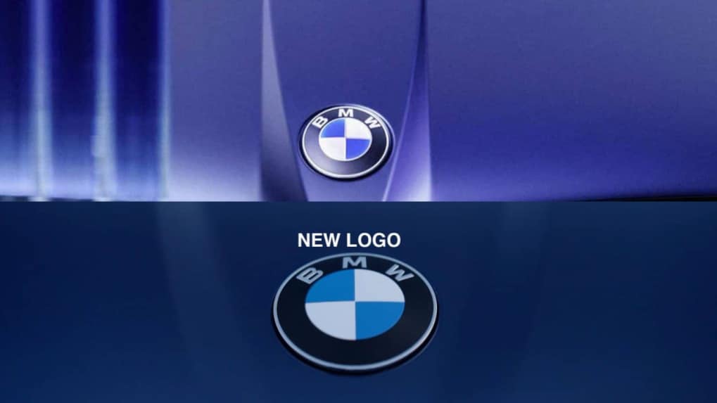
BMW unveils new logo, gives iconic roundel a makeover for Neue Klasse era
BMW has subtly redesigned its iconic roundel, debuting on the iX3. The new logo removes inner chrome rings and bars, adds a matte finish, and unifies branding across electric and combustion models.
ADVERTISEMENT
BMW has introduced a subtle redesign of its iconic roundel logo, debuting on the new iX3 at the Munich Motor Show. The update, though understated, reflects the brand’s evolving identity as it enters the Neue Klasse era.
At first glance, the badge appears unchanged. However, a closer look reveals the removal of the inner chrome ring and the horizontal and vertical bars that once divided the blue-and-white quadrants. The black ring now carries a satin, matte-like finish, while the “BMW” lettering has been refined into a slimmer, more precise form. Remaining chrome accents adopt a smoked, modernized effect.
Notably, BMW has also eliminated the blue outer rim previously used to distinguish its electrified models. The move signals a design unification—electric and combustion cars will now share the same roundel, underscoring BMW’s stance that EVs are no longer a separate branch but the brand’s mainline focus.
Speaking to BMWBLOG, Oliver Heilmer, Head of BMW Design, explained the intent, “We wanted to keep the heritage, but bring more precision to the logo. The chrome is still there, but with a refined shine you might find in watches. It’s flat, but tactile when you touch it.”
The update aligns BMW with a broader industry trend, where automakers such as Volkswagen and Porsche have refreshed heritage logos for the digital and electric age.

