Pantone announces Color of the Year 2026: What it indicates for brands and why the exercise continues
Pantone has named Cloud Dancer as its Color of the Year for 2026. Here’s what the annual selection represents, how brands typically engage with it and why the exercise continues.
ADVERTISEMENT
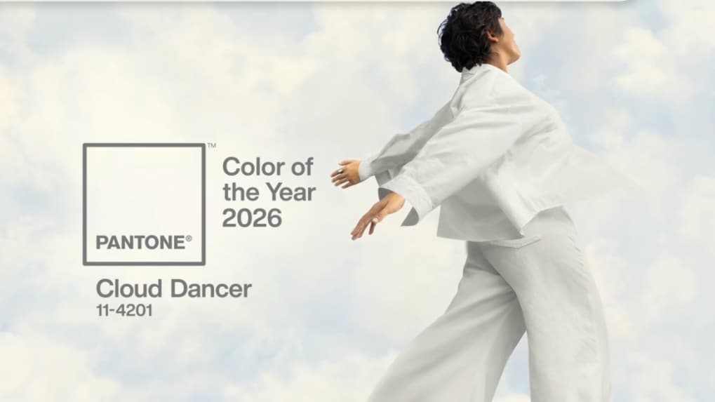
Pantone has announced Cloud Dancer (Pantone 11-4201) as its Color of the Year for 2026, describing the soft, near-neutral shade as one that “quiets the mind and provides a blank canvas to create”.
The annual selection, made by the Pantone Color Institute, is widely referenced across industries including fashion, design, beauty, interiors and consumer products, where colour plays a role in product development, visual identity and seasonal planning.
Latest post by Pantone:
Introduced in 2000, Pantone’s Color of the Year has since become a recurring fixture in the global design calendar, often shaping discussions around colour direction for the year ahead.
How brands typically engage with the Color of the Year
Pantone has consistently stated that its Color of the Year is not intended as a directive for brands, but as a reference point for creative exploration. Adoption of the colour varies by category, geography and individual brand strategy.
Historically, colours highlighted by Pantone have been referenced by creative teams and incorporated in different ways across campaigns, collections and design systems, particularly in sectors where colour decisions are closely tied to aesthetics, differentiation and visual storytelling.
With Cloud Dancer, Pantone has positioned the shade as adaptable rather than dominant. In its accompanying material, the institute has presented the colour alongside multiple palettes, illustrating how it can function as a base or supporting tone across different applications.
For brands, this framing allows the colour to be used selectively, such as in backgrounds, packaging accents or spatial design, rather than as a defining visual signature.
Also read: Following Australia, Denmark plans strict social media limits for children under 15
Why Pantone releases a Color of the Year
According to the Pantone Color Institute, the Color of the Year is the outcome of a year-long process that examines how colour is used and perceived across global culture. The institute studies influences from fashion, art, travel, design, technology and social behaviour to identify broader patterns in colour preference and usage.
Pantone has described the initiative as a way to capture a cultural moment through colour, rather than predict or prescribe trends. The selection is intended to provide a shared reference for designers, brands and manufacturers working across different markets, materials and platforms.
The Color of the Year also aligns with Pantone’s broader role as a colour standardisation and consulting authority. Through the Pantone Color Institute, the company advises brands on colour usage across identity, product development and visual communication.
A reference point rather than a mandate
Over time, Pantone’s Color of the Year has come to function as a reference point rather than a mandate. While brands interpret and apply the selection differently, the announcement often informs conversations around visual direction and colour usage in the year ahead.
With Cloud Dancer, Pantone has emphasised versatility, neutrality and openness. As with previous selections, the extent to which the colour appears in branding and products will ultimately depend on individual brand objectives and creative decisions.


